
Canvas of the Table
How thoughtful plating shapes perception, prepares the senses, and turns a meal into a memorable narrative
The Plate as Stage and Frame
Before a single element touches porcelain, the cook chooses a surface that will guide every decision that follows, because the plate is more than a vessel, it is a stage that sets scale, contrast, and mood. Matte finishes tame glare and lift detail, glossy glazes amplify shine and moisture, rims create boundaries that contain sauces while coupe shapes invite freer movement. A warm stoneware bowl suggests comfort and depth, a thin white disk promises clarity and speed, black slate tightens color relationships and pushes greens forward. The right frame does not steal attention, it lends it, so the food speaks with presence rather than shouting.
Composing With Intention
Plating begins with a question about purpose, because a plate that tries to say everything often says little. One focal element should lead, supporting components should harmonize, and empty space should breathe like silence between notes. Triangular layouts create energy and direction, radial layouts calm the gaze, serpentine layouts guide the eye across a story in small steps. Repetition establishes rhythm, odd numbers keep clusters lively, and micro asymmetry prevents stiffness while preserving balance. The hand places each piece as if it mattered, because it does, since meaning grows from accumulation and care at small scale.
Color Theory for Cooks
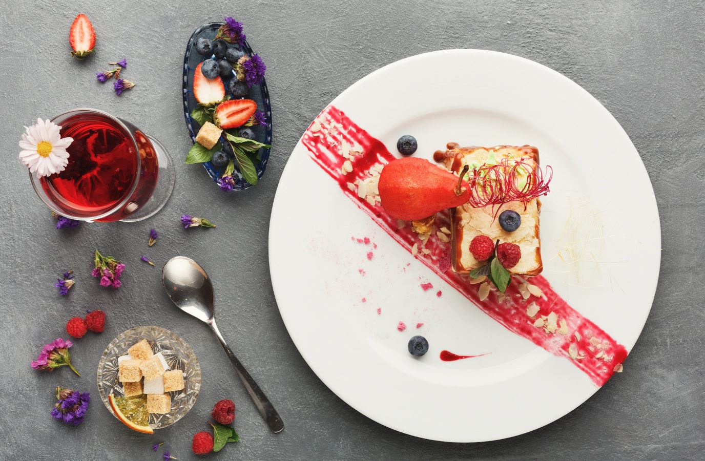
Color directs expectation before aroma arrives, so cooks treat pigment like seasoning. Complementary pairs such as green herbs against red vegetables heighten both sides, near neighbors like yellow and orange soothe the eye, and a field of neutrals allows a single saturated dot to sing. Warm hues feel richer and closer, cool hues feel cleaner and farther, and white space resets the palate like a quiet breath. Natural color reads honest, so overworked dyes and muddled sauces erode trust, while quick blanching and chilled oils keep chlorophyll bright and true.
Height, Depth, and the Third Dimension
Plates live in three dimensions even when photographed flat, so height is not a trick but a tool that signals texture and value. A gentle stack creates hospitality because it keeps heat at the center, a shallow slope invites a clean spoon path, and one crisp shard or tuile adds lift without hazard. Height should never feel precarious, since structure that collapses in transit breaks the story and the mood. The best vertical accents are edible, clear in purpose, and easy to eat without negotiation.
Texture as Contrast and Chorus
Texture makes the mouth pay attention, so a thoughtful plate pairs soft with crisp and creamy with brittle to create a chorus rather than a solo. A silky puree can hold a roasted vegetable that crackles, a caramelized crust can protect a tender interior, and a toasted seed can snap against custard to keep sweetness lively. Texture also lives in moisture, because gloss signals juiciness while a dry crumb invites a sip, so sauces and oils should arrive in measured amounts that keep the plate vivid rather than slick.
Saucework That Draws Without Distraction
Sauces complete thoughts, yet they can easily overwhelm if spread without plan. Pools beneath meat preserve heat and protect crisp edges, thin rails guide the fork and add acidity exactly where needed, and droplets add punctuation that helps the mouth find balance. Brush strokes read bold, splatters read urgent, and clean circles read ceremonial, so the chosen gesture should match the dish and the room. Season sauces with the same precision as solids, since every stroke changes not only look but structure and taste.
Negative Space and the Breath of the Plate
Empty space looks like nothing but functions like air, giving contrast a place to rest and aromas a path to rise. Crowded plates force the gaze to scan without relief, while open compositions focus attention and suggest confidence. Space also manages temperature by exposing edges to cool and allowing steam to escape where it should, so design choices serve both eye and physics. When in doubt, remove one garnish and check whether the plate speaks more clearly, since clarity is often the quietest voice in the room.
Portioning With Grace and Logic
Good plating honors appetite and cadence, not only aesthetics, so portion size aligns with course position and menu length. Early bites should energize without weight, center courses should satisfy while leaving room for the next thought, and desserts should complete rather than drown. Weight distribution matters because a plate that tips or slides signals carelessness, while balanced mass reads calm. Consider bite count for each element so no flavor vanishes early or lingers after its partner is gone.
Heat and Chill as Invisible Design
Temperature shapes aroma release and texture stability, which means the plate must support the thermal plan. Warm plates protect sauces from seizing and fats from dulling, chilled plates keep raw fish precise and creams proud, and room temperature plates prevent shock that cracks sugar or chocolate. The pass should track dwell time so radiant heat from the lamp does not tighten delicate proteins or thin a set gel. Temperature control rarely receives applause, yet it writes half the experience without words.
Ergonomics of the Fork Path
Every composition should invite an obvious first bite and a comfortable sequence after that first step. Tall shards placed at the near edge can block access, hard pits hidden under leaves pose risk, and sticky sauces in the wrong corridor smear handles and sleeves. Stagger tough cuts with tender neighbors so the guest can alternate effort and rest. A plate that is easy to eat feels generous even before the palate judges flavor.
Lighting, Shadows, and Surface Read
The dining room writes the final layer of the picture, so cooks consider how house lights shape contrast and sheen. Matte glazes avoid hot spots under strong LEDs, glossy reductions benefit from soft fill that reveals waves rather than white dots, and tall garnishes cast shadows that either dramatize or muddy detail. If the room changes light between lunch and evening, small adjustments to oiling and sauce viscosity keep the plate consistent across services.
Choosing the Right Vessel
Bowls concentrate aroma and protect temperature, flatware friendly rims ease scooping for broths and grains, and high walls help saucy stews travel without spill. Deep plates reduce splash during service, double walled cups preserve cold for granitas and semifreddos, and small side dishes corral crunchy accessories that should remain audible until the final bite. The vessel declares intent before the first smell arrives, so choose with message in mind.
Garnish With Purpose
A garnish should either deliver flavor, alter texture, or add scent, and if it does none of these, it has no home. Tender herbs are torn near the pass to preserve perfume, citrus zests are shaved in thin ribbons that dissolve on contact, and seed mixes are toasted enough to smell alive but not bitter. Powder rains can dull moisture and mute sound when overdone, while micro leaves need a matching scale to avoid looking stranded. Beauty follows function because the mouth notices more than the camera.
Plating for Shared Service
Family style designs solve different problems than individual plates. Centerpieces must carve cleanly without flooding sides, sauces should land in wells that refill easily, and garnish should resist bruising as tongs move. Contrast belongs in each scoop, not only in the full display, which means layering in repeating bands so every guest enjoys the same arc. The platter should travel safely across a table without spilling or cooling unevenly, so weight and handle position matter as much as color.
Handling Crunch and Time
Crisp elements age the moment they meet moisture and steam, so plating order defends them. Drain fried pieces briefly on a rack, rest them on dry components, and add thin sauces at the table when possible. For long passes, choose resilient crunch like toasted grains, seed glass, or baked meringue shards that hold texture with grace. The finish line for crunch is the first bite, so every second counts.
Plating for Dietary Paths Without Second Class Signals
All guests deserve plates that feel complete and confident. Plant based compositions gain body from legumes and grains shaped with care, dairy free desserts lean on emulsified fruit and nut pastes for plush mouthfeel, and gluten free structures rely on fragile layers set with temperature instead of wheat. Remove nothing without adding intention, since subtraction alone reads as absence rather than design.
Storytelling Through Sequence
A menu forms an exhibition in small rooms, so each course should speak a new sentence while echoing the last. Openers brighten and set vocabulary, middle plates deepen and slow, and closers clarify and console. Visual motifs help memory, like repeating a spice color or a leaf shape across the meal. The guest should feel gently guided rather than pushed, which comes from steady pacing at the pass and consistent plate language.
Chocolate, Caramel, and the Gloss Problem
Sweets invite shine but punish excess. Over oiled glazes slip and pool, under hydrated gels turn dull and crack, and chilled plates can seize chocolate into grain. Balance oil with surface tension, temper chocolate properly, and heat knives for clean slices that keep layers readable. A single bitter counter from cocoa nib or coffee salt keeps sweetness awake without shouting.
Bread and Butter as First Impression
The prelude sets trust, so bread service receives the same attention as grand plates. Warm loaves open at a seam that invites tearing without crumbs flying, butter sits at workable temperature, and salt flakes land where the knife will pass. Small bowls for flavored oils should be shallow enough to coat bread without drenching it. If the room celebrates grains, the story begins here or it never quite begins.
Breakfast and Brunch Without Mess
Morning plates fight liquids and runny yolks, so channels and textures protect edges. Crisp bases like griddled polenta or toasted sourdough catch sauces and lift eggs, delicate leaves sit on top rather than beneath, and fruit cuts in odd sizes prevent rolling that smears sauces. Sweet and savory items should not bleed into each other unless designed to mingle, which keeps flavors legible and service tidy.
Cold Plates for Raw Preparations
Raw fish and cured meats demand clean geometry and strict temperature. Slice against grain to reveal shine, stagger layers for easy lift, and add acid in measured arcs rather than floods. Ice beds numb the tongue, so chilled plates win over crushed ice for most dining rooms. Oil should appear as glints not puddles, and herbs should arrive dry and bright to avoid wilting on contact.
Tools That Make Hands Precise
Offset spatulas move sauces with calm lines, tweezers place small herbs without bruising, ring molds suggest form without trapping, and squeeze bottles draw tight curves that wipe clean in one pass. Brushes that hold their edge add texture without stray hairs, microplanes create perfumed snow on demand, and hot spoons glide custards smooth. Tools only help when the hand already knows the plan, so practice on blank plates until gestures feel natural and quick.
Photography Without Compromising Flavor
Images help guests choose and help teams remember, yet the camera should never dictate taste. Avoid heavy oiling and artificial shine for the lens, shoot quickly to keep herbs alive, and use reflectors rather than extra glaze to catch light. Record angles that match the diner perspective so expectations align, and note plating maps alongside images for training and consistency.
Training the Team With Maps and Metrics
Great plating survives only when it repeats under pressure, so kitchens rely on visual diagrams, gram weights, and clear sequencing steps. A station card lists order of placement, spoon sizes, and wipe zones, while a photo shows the final result. Pre service tastings confirm temperature and seasoning, and mock passes test timing so plates do not die under lamps. Consistency is not the enemy of creativity, it is the gift that allows creativity to reach the table intact.
Sanitation and the Invisible Line
Beauty that ignores safety fails. Cold items ride over raw proteins only on dedicated boards, tasting spoons never reenter a pot, and cloths for wiping rims stay clean and dry rather than perfume stained. Gloves have their place but clean hands often work better when washed frequently and kept dry. A spotless rim does more than impress, it reassures, and reassurance heightens flavor because the mind relaxes.
Service Choreography From Pass to Table
Plating lives or dies in motion, so the route from kitchen to guest receives design like any other step. Tray maps prevent crowding, table approach respects handedness, and synchronized landings keep heat aligned so a shared sauce arrives at the same moment for everyone. Announcing key elements briefly invites the first bite to land where it should, and clearing with care preserves lingering aromas while the next course builds anticipation.
Plating for Travel and Delivery
Modern hospitality often leaves the dining room, so compositions need road worthy structure. Vented containers prevent steam from erasing crisp edges, sauces travel in small cups that pour cleanly, and layered builds keep cold from flattening hot. Choose cuts that reheat kindly, provide a simple plating note for guests who enjoy arranging, and include a bright finishing element like citrus or herbs that wakes the dish after the journey.
Troubleshooting Under Fire
Every service brings surprises, so quick fixes save plates and morale. If a sauce breaks, strain and mount with a small dash of cold liquid fat while whisking off heat, then choose a brush stroke rather than a pool to hide minor blemishes. If greens wilt, swap to heartier herbs or add a last second chill. If a smear goes wrong, convert to a quenelle or a clean dot pattern and wipe the rim with confidence. Recovery reads like poise when done without panic.
Sustainability on the Surface
Responsible plating respects material and waste as part of design. Garnishes that never touch the tongue do not belong, trimmings become crisps or powders that add honest texture, and edible flowers come from growers who value soil as much as color. Reusable service ware replaces disposables where possible, and dish shapes that stack safely reduce breakage and transport energy. Beauty that considers the world tastes better because conscience lightens the meal.
Accessibility and Inclusive Visuals
Not every guest perceives color or texture in the same way, so inclusive plating uses strong light dark contrast, clear edges, and simple layouts that do not rely solely on subtle hue shifts. Provide tactile cues like crunchy toppers that announce presence, offer cut options that reduce resistance, and design bowls and spoons that help capture small elements. Hospitality sees the person as much as the plate.
Seasonal Plates That Breathe the Day
Season writes the palette and texture library, so plating follows the weather and the market. Spring wants lifted greens and quick oils, summer prefers room temperature dishes with wide space and juice that glints, autumn invites roasted gloss and grounding shapes, winter welcomes deep bowls and quiet colors with sparks of bitter or preserved fruit. A plate that fits the day feels inevitable and right, which is a form of grace.
Costing Without Killing Magic
Budgets shape composition as surely as color and height, so smart plates maximize impact per gram. Use bold accents in small doses, build volume with inexpensive but delicious elements like grains and roots treated with respect, and reserve rare items for the focal bite rather than scattering them thin. Honest value reads on sight because generosity looks like care, not excess, and guests feel that truth before the fork rises.
Signature Details That Travel Across Menus
Houses become memorable through small consistent choices that never feel repetitive. A certain leaf torn at the table, a sauce finish that lands beneath rather than above, a subtle brush that hints at the sea or the hearth, these create identity without trapping the team. Signature details should emerge from the kitchen’s values, not from trend, so they age with dignity and adapt to new dishes easily.
The Plate as Promise
At its best, plating is a promise kept, a quiet claim that what you see will match what you taste and what you feel. Line and color lead the eye, texture and temperature guide the hand, and the first bite fulfills the story that began when the dish entered the room. When cooks frame food with humility and intention, the table becomes a place where care is visible, trust grows with each course, and memory records not only flavor but tenderness in the craft itself.